3.4 Figures and Tables
Visual elements such as graphs, charts, tables, photographs, diagrams, and maps capture your readers’ attention and help them to understand your ideas more fully. They are like illustrations that help tell the story. These visuals help to augment your written ideas and simplify complicated textual descriptions. They can help the reader understand a complicated process or visualize trends in the data. The key concept to remember here is that visuals clarify, support, illustrate, and augment your written text. In the current shift to visual narrative, they sometimes play an important role in conveying ideas and information in a concise and memorable visual format. Therefore, they can sometimes replace written text. Visuals may save you a hundred words or so of additional explanation and clarification when used effectively. If you have visual elements in your document, they must be based on and supplement your written content. Throwing in “gratuitous graphics” just to decorate or take up space can confuse your reader.

It is important to choose the right kind of visual to convey the story you want your reader to understand. If visuals are poorly chosen or poorly designed for the task, they can actually confuse the reader and have negative consequences. For example, it’s very likely that the first thing you noticed when you opened this page was the image above. Did you wonder why is it there? What it is about? Has it distracted you? The fact that it contains no caption or labels deepens the mystery.
(The Purpose of Visuals in Communication, 2019)
Conventions for Integrating Visuals in your Document
Each style of visual has its own conventions that you will recognize after you have seen enough of them. In addition, different publications have different style guides that dictate the specifics of how to format and integrate visual elements. In general, however, whenever you integrate any kind of visual, you should adhere to five key rules.
- Give each visual a numbered caption that includes a clear descriptive title (e.g., “Figure 1: Sales of Blue Corollas in 2021”).
- Refer to the caption number within the body text and discuss the visual aid’s content.
- Label all units (x and y axes, legends, column box heads, parts of diagrams, etc.).
- Provide the source for the data and/or visual image if you did not create it yourself.
- Avoid distorting the data or image. Review the video below for some tips on spotting misleading images.
(How to Spot a Misleading Graph, 2017)
In addition, visual elements should also be surrounded with sufficient passive space to emphasize the image and enhance its readability. If copying and pasting an image, make sure all elements are clear and the print size is readable. A visual that has been shrunk down to an unreadable size does not help the reader understand your ideas. If at all possible, try to orient the visual image in the same direction as the body text.
Examine Figure 3.4.1 below. Do you understand what information it conveys? What is missing?

If you look carefully, you might be able to guess what story this graph is telling. However, the lack of a descriptive caption and labeling of axes makes it impossible to know for sure. Compare it to Figure 3.4.2 below.

Figure 3.4.2 has a numbered caption (which I have just referred to in my paragraph), a descriptive title, and it has properly labelled x and y axes and legends. It also cites the source for the graph in the caption using an in-text citation, which is included as a full reference below. The original image has not been distorted in any way. Thus, it follows the five key rules listed above.
In addition to those five general rules, there are specific guidelines for implementing them. These are outlined in detail in A Guide to Writing Formal Technical Reports (Potter, 2021).
Knowledge Check
Terminology
Visual elements are referred to as either Tables or Figures. Tables are made up of rows and columns and the cells usually have numbers in them (but may also have words or images). Figures refer to any visual elements—graphs, charts, diagrams, photos, etc.—that are not tables. They may be included in the main sections of the report, or if they contain supplemental material they may be contained in an appendix. Ensure that figures and tables are not broken over two pages. Consider placing tables that require a full page in an appendix.
Labeling Tables and Figures
Tables and figures must all be labeled consistently throughout your documents with numbered captions that clearly identify and describe them. In technical communication, figure captions are placed below the figures, while table titles must be placed above the tables. This is because we generally read tables from the top down, and therefore want to see the caption at the top. Figures are not always read top-down. When you open a page and see a figure, the first thing you want to know is “what is that?” The caption below it should immediately identify what the figure represents for the reader without the reading having to read the paragraph before it.
Use the following conventions to assist the reader in understanding your graphics:
- Numbering: Table and figures are numbered sequentially, but separately:
E.g., Table 1, Table 2, Figure 1, Figure 2, Table 3, etc.
- Captioning: After the figure or table number, add a descriptive caption that clearly indicates what the figure or table illustrates without having to read anything else on the page.
There are two systems for numbering figures and tables within your document:
- Simple Consecutive Numbering: All figures and tables are numbered consecutively (Figure 1, Figure 2, Figure 3, Table 1, Table 2, Table 3, etc.) throughout the document regardless of which section they are in.
- Section-based Numbering: Within each section, figures and tables may be numbered sequentially through each section (e.g., Table 1.1 refers to the first table in section 1, Table 2.4 refers to the fourth table in section 2).
If a large number of illustrations are presented, the latter option is the better choice. This can become confusing, however, when using sub-sections.
If the table or figure that you present in your report was not created by you, but comes from other sources, you must include a citation for the original source in your caption; e.g., Figure 1. Network Design (Grant, 2021). You must ensure that all figures and tables represent data accurately and ethically, and that they do not distort data to create bias.
Using the Insert → Caption … function will allow MS Word to keep track of the figure and table numbering for you, and allow you to auto-create a List of Figures and Tables at the beginning of your document.
If you don’t use the Insert Caption function, then you should manually change the font of your captions to distinguish them from body text. Caption font is usually slightly smaller than body font and is often italicized.
Referring to Tables and Figures in your Text
Any figures or tables you use in your document must be discussed in your text. Use the following guidelines when discussing and referring to tables and figures:
- Place the table/figure immediately below the paragraph where it is first mentioned in the text.
- Refer to tables and figures in your text by their numbers, not their placement in the text. E.g, “See Figure 9 for a detailed schematic” (not “see the figure below”); “The test results are summarized in Table 1.”
- Format the in-text reference to the tables and figures in bold (optional, but be consistent throughout your document).
Knowledge Check
|
|
|
Selecting the Right Visual
Every type of visual aid serves a different purpose. For example, a pie chart displays a comparison of parts to a whole, while a bar chart shows comparisons of various variables to each other. Below is a description of visual and graphic aids commonly incorporated into technical reports adapted from Stand Up, Speak Out: The Practice and Ethics of Public Speaking (n.a., 2012). Note: APA Style recommends labeling for figures to be situated above the visual aid. In technology, figures are typically labeled below.
Charts
A chart is commonly defined as a graphical representation of data (often numerical) or a sketch representing an ordered process. Whether you create your charts or do research to find charts that already exist, it is important for them to exactly match the specific purpose in your document or presentation.
In the rest of this section, we’re going to explore three common types of charts: statistical charts, sequence-of-steps chart, and decision trees.
Statistical Charts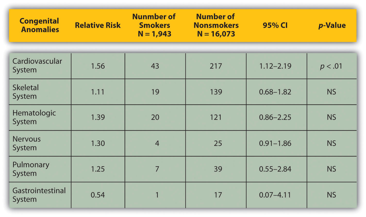
Figure 3.4.3 Birth Weight Chi-Square. Source: Woods, S. E., & Raju, U. (2001). Maternal smoking and the risk of congenital birth defects: A cohort study. Journal of the American Board of Family Practitioners, 14, 330–334.
For most audiences, statistical presentations must be kept as simple as possible, and they must be explained. When visually displaying information from a quantitative study, you need to make sure that you understand the material and can successfully and simply explain how one should interpret the data. If you are unsure about the data yourself, then you should probably not use this type of information. This is surely an example of a visual aid that, although it delivers a limited kind of information, does not speak for itself.
Sequence-of-Steps Charts
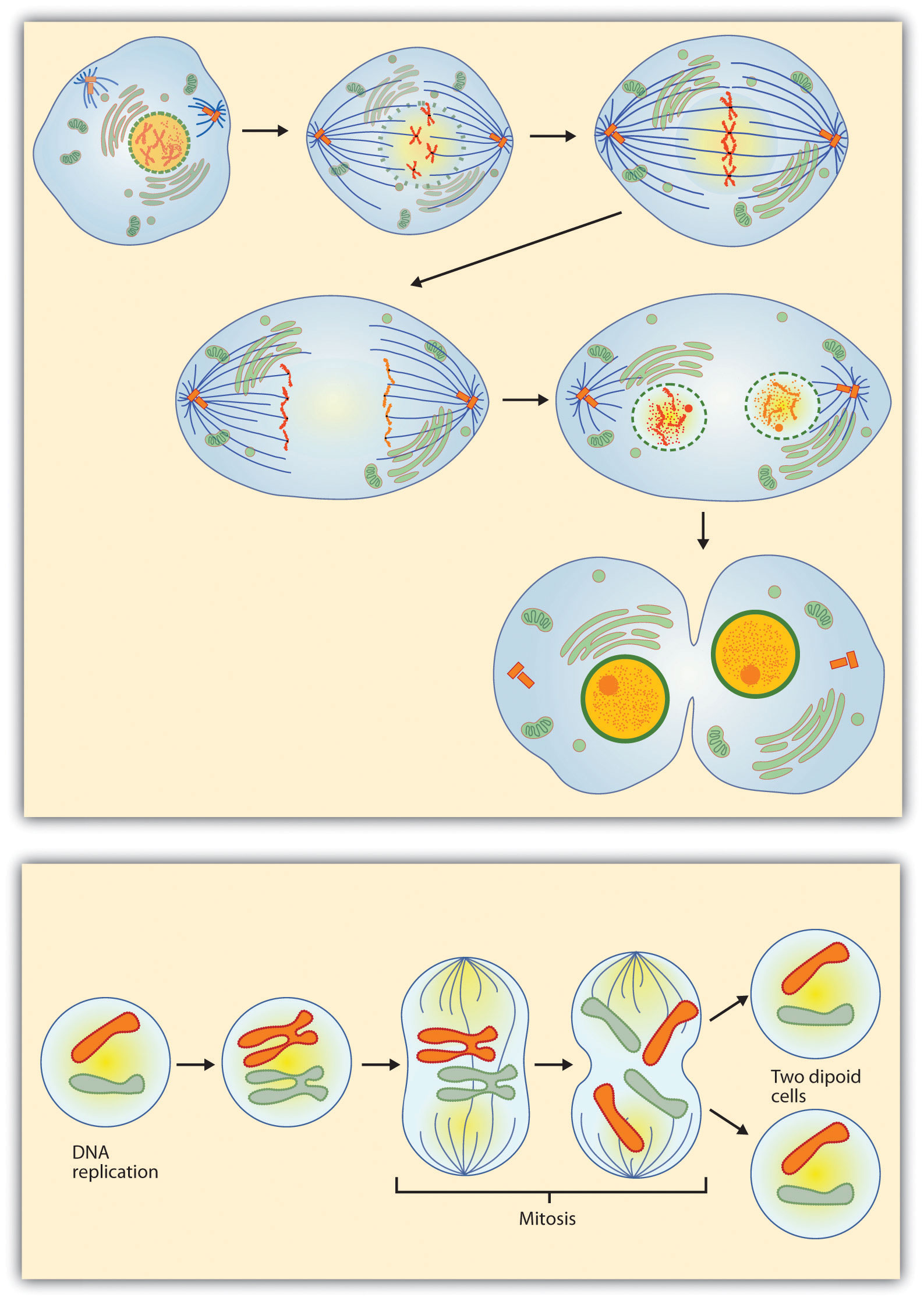
Figure 3.4.4 Steps in Cell Reproduction. Source: Images courtesy of LadyofHats, http://commons.wikimedia.org/wiki/File:MITOSIS_cells_secuence.svg, and the National Institutes of Health, http://commons.wikimedia.org/wiki/File:MajorEventsInMitosis.jpg.
Charts are also useful when you are trying to explain a process that involves several steps. These two visual aids in Figure 3.4.4 depict the process of cell division called mitosis using a sequence-of-steps chart, but they each deliver different information. The first chart lacks labels to indicate the different phases of cell division. Although the first chart may have more color and look more polished, the missing information may confuse the audience. In the second chart, each phase is labeled with a brief explanation of what is happening, which can help the audience understand the process.
Decision Trees
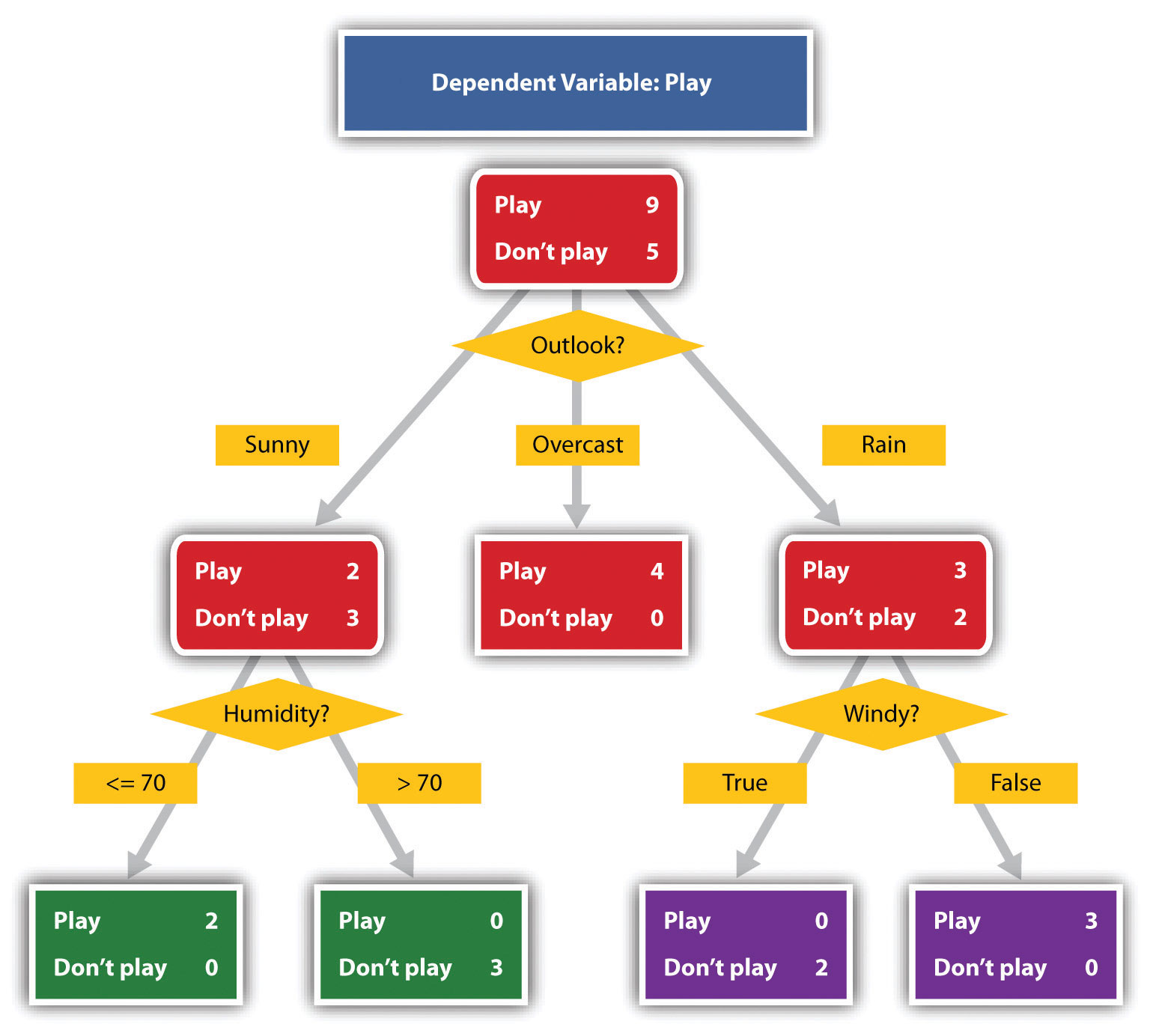
Figure 3.4.5 To Play or Not to Play. Source: Image courtesy of T-kita, http://commons.wikimedia.org/wiki/File:Decision_tree_model.png.
Decision trees are useful for showing the relationships between ideas. Figure 3.4.5 shows how a decision tree could be used to determine the appropriate weather for playing baseball. As with the other types of charts, you want to be sure that the information in the chart is relevant to your purpose and that each question and decision is clearly labeled.
Graphs
Strictly speaking, a graph may be considered a type of chart, but graphs are so widely used that we will discuss them separately. A graph is a pictorial representation of the relationships of quantitative data using dots, lines, bars, pie slices, and the like. Graphs show the variation in one variable in comparison with that of one or more other variables. Where a statistical chart may report the mean ages of individuals entering college, a graph would show how the mean age changes over time. A statistical chart may report the number of computers sold in the United States, while a graph will show the breakdown of those computers by operating systems such as Windows, Macintosh, and Linux. Technical communicators can show graphs using a range of different formats. Some of those formats are specialized for various professional fields. Very complex graphs often contain too much information. If the graph is cluttered, it becomes difficult to comprehend.
In this section, we’re going to analyze the most common graphs technical communicators use in their documents and presentations: line graphs, bar graphs, and pie graphs.
Line Graph
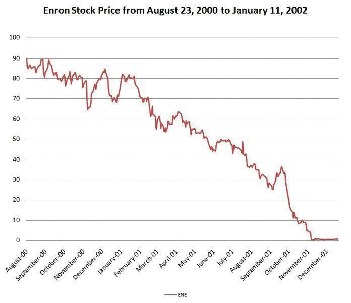
Figure 3.4.6 Enron’s Stock Price. Source: Image courtesy of Nehrams 2020, http://commons.wikimedia.org/wiki/File:EnronStockPriceAug00Jan02.jpg.
A line graph is designed to show trends over time. In Figure 3.4.6, we see a line graph depicting the fall of Enron’s stock price from August 2000 to January 2002. Notice that although it has some steep rises, the line has an overall downward trend clearly depicting the plummeting of Enron’s stock price. Showing such a line graph helps the reader see the relationships between the numbers.
Bar Graph
Bar graphs are useful for showing the differences between quantities. They can be used for population demographics, fuel costs, math ability in different grades, and many other kinds of data.
The graph in Figure 3.4.7 is well designed. It is relatively simple and is carefully labeled, making it easy for you to guide your reader through the quantities of each type of death. The bar graph is designed to show the difference between natural deaths and homicides across various age groups. When you look at the data, the first grouping clearly shows that eighteen- to twenty-four-year-olds are more likely to die because of a homicide than any of the other age groups.
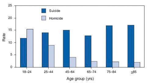
Figure 3.4.7 Natural Death vs. Homicide. Source: Image courtesy of Centers for Disease Control and Prevention, http://commons.wikimedia.org/wiki/File:Homicide_suicide_USA.gif.
The graph in Figure 3.4.8 is a complicated bar graph depicting the disparity between the haves and the have nots within the United States. On the left hand side of the graph you can see that the top 20% of people within the United States account for 84.7% of all of the wealth and 50.1% of all of the income. On the other hand, those in the bottom 40% account for only 0.2% of the wealth and 12.1% of the actual income.
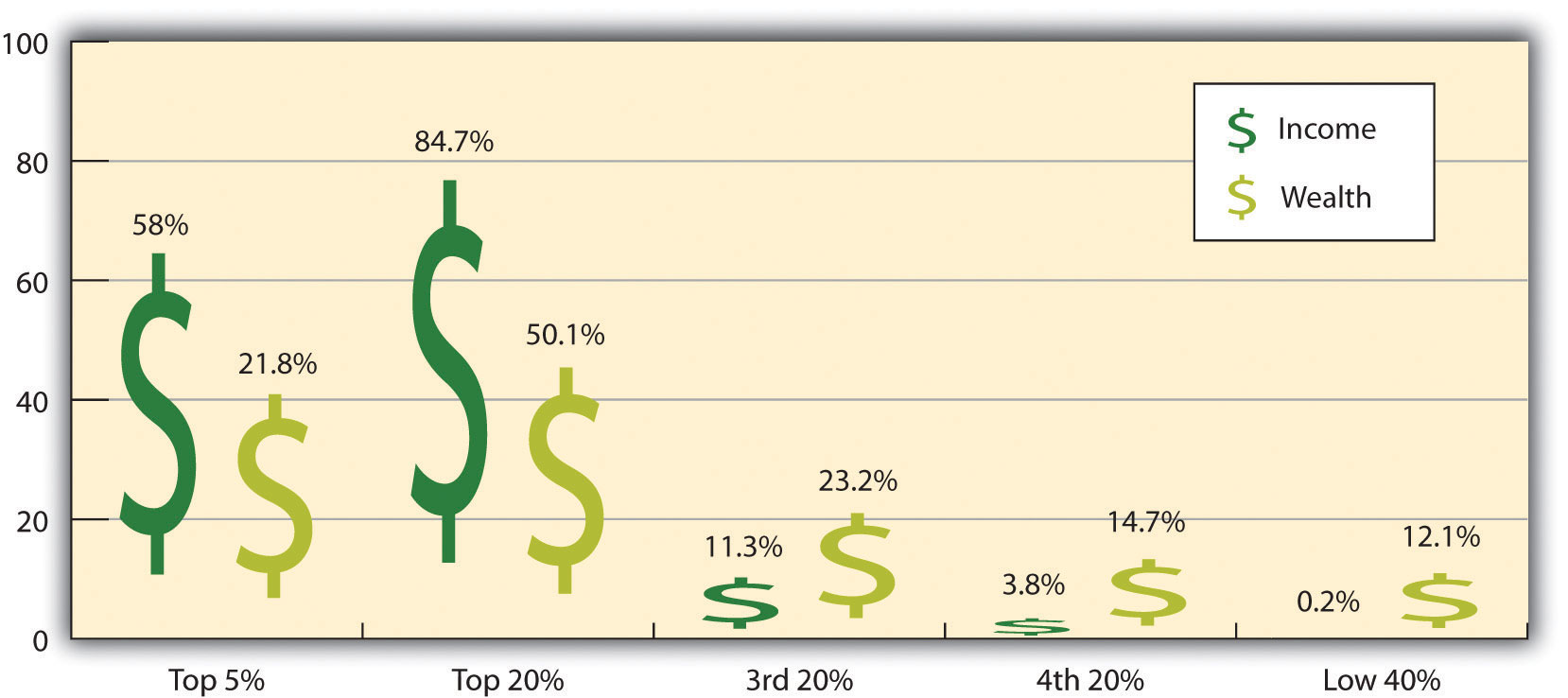
Figure 3.4.8 Distribution of Income and Wealth in the United States. Source: Wolff, E. N. (2007). Recent trends in household wealth in the United States: Rising debt and the middle-class squeeze (Working Paper No. 502). Retrieved from the Levy Economics Institute of Bard College website: http://www.levy.org/pubs/wp_502.pdf
While the graph is very well designed, it presents a great deal of information. In a document, readers will have time to sit and analyze the graph, but in a speaking situation, audience members need to be able to understand the information in a graph very quickly. For that reason, this graph is probably not as effective for speeches as the one in Figure 3.4.7.
Pie Graph
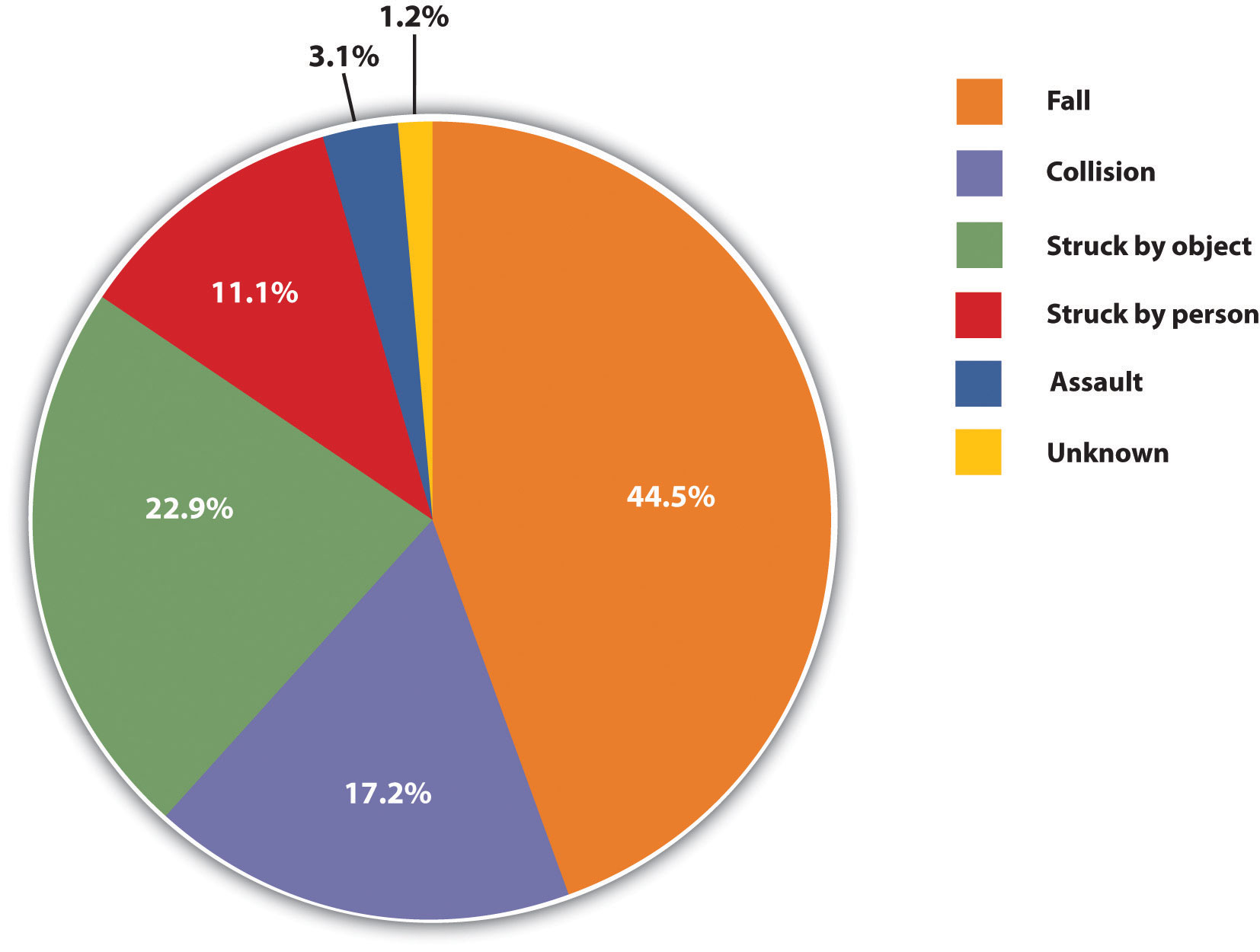
Pie graphs should be simplified as much as possible without eliminating important information. As with other graphs, the sections of the pie need to be plotted proportionally. In the pie graph shown in Figure 3.4.9, we see a clear and proportional chart that has been color-coded. Color-coding is useful when it’s difficult to fit the explanations in the actual sections of the graph; in that case, you need to include a legend, or key, to indicate what the colors in the graph mean. In this graph, readers can see very quickly that falls are the primary reason children receive concussions.
Note that the information is organized from the greatest percentage to the smallest in a clockwise direction. Use this method to represent the information in a logical order.
The pie graph in Figure 3.4.10 is jumbled, illegible, confusing, and overwhelming in every way. The use of color coding doesn’t help. Overall, this graph simply contains too much information and is more likely to confuse an audience than help them understand something.
Figure 3.4.9 Causes of Concussions in Children. Source: Stand Up, Speak Out: The Practice and Ethics of Public Speaking, 2012.
Knowledge Check
Representations
In the world of visual aids, representations is the word used to classify a group of aids designed to represent real processes or objects. Often, technical communicators want to visually demonstrate something that they cannot physically bring with them to the speech. In this section, we’re going to explore four common representations: diagrams, maps, photographs, and video or recordings.
Diagrams
Diagrams are drawings or sketches that outline and explain the parts of an object, process, or phenomenon that cannot be readily seen. Like graphs, diagrams can be considered a type of chart, as in the case of organization charts and process flow charts.
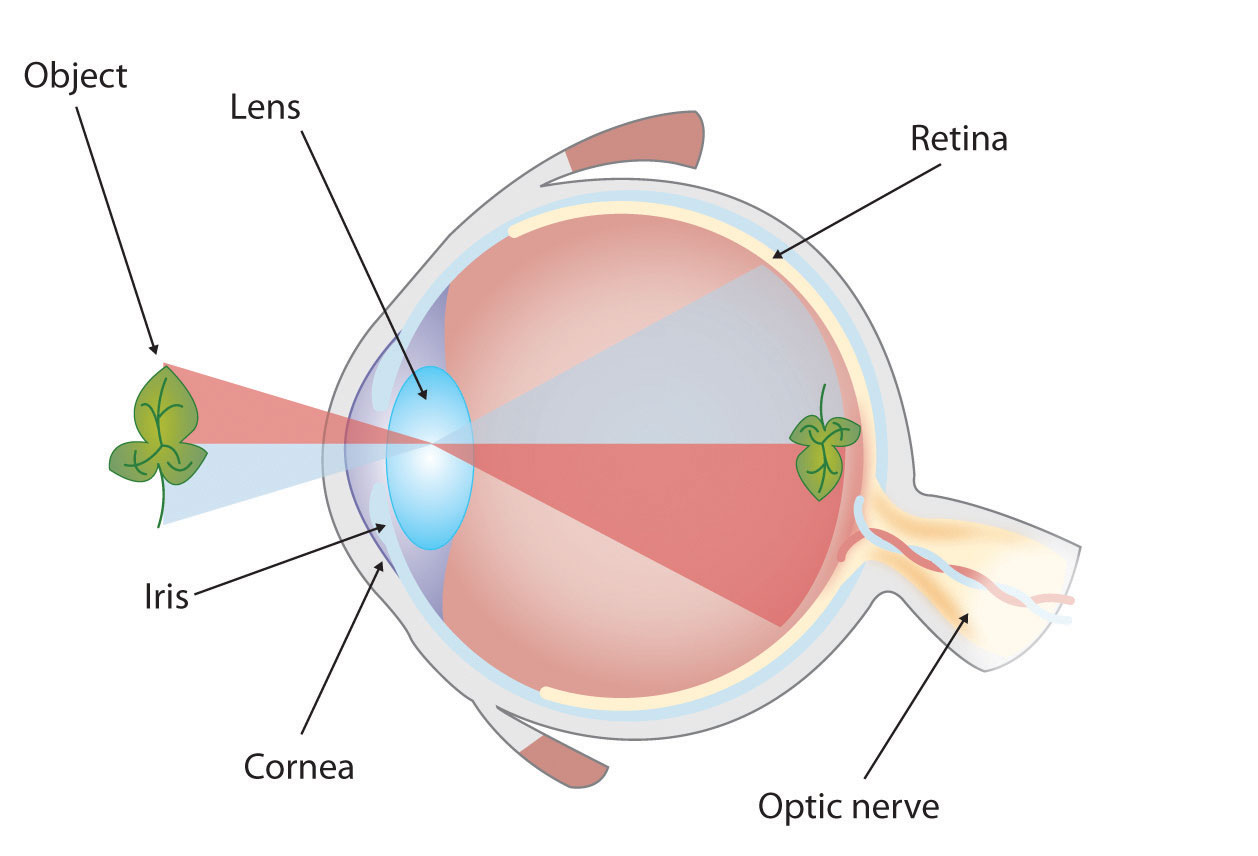
Figure 3.4.11 The Human Eye. Source: Stand Up, Speak Out: The Practice and Ethics of Public Speaking, 2012.
When you use a diagram, be sure to explain each part of the phenomenon, paying special attention to elements that are complicated or prone to misunderstanding. In the example shown in Figure 3.4.11, you might wish to highlight that the light stimulus is reversed when it is processed through the brain or that the optic nerve is not a single stalk as many people think.
Maps
Maps are extremely useful if the information is clear and limited. There are all kinds of maps, including population, weather, ocean current, political, and economic maps, so you should be able to find the right kind for the purpose of document. Choose a map that emphasizes the information you need to deliver.
The map shown in Figure 3.4.12 is simple, showing clearly the geographic location of Nigeria. This can be extremely valuable for some audiences who might not be able to name and locate countries on the continent of Africa.


Figure 3.4.13 is a map of the state of Rhode Island, and it emphasizes the complicated configuration of islands and waterways that characterize this state’s geography. Although the map does not list the names of the islands, it is helpful in orienting the audience to the direction and distance of the islands to other geographic features, such as the city of Providence and the Atlantic Ocean.
Photographs and Drawings

Figure 3.4.14 Ship’s Rigging. Source: Image courtesy of Mathieu Dréo, http://commons.wikimedia.org/wiki/File:Tall_ship_rigging_in_amsterdam_close.jpg.
Sometimes a photograph or a drawing is the best way to show an unfamiliar but important detail. Figure 3.4.14 is a photograph of a ship’s rigging. This photograph emphasizes the sheer amount and complexity of the ship’s rigging.
Video or Audio Recordings
Another very useful type of visual aid is a video or audio recording. Whether it is a short video from a website such as YouTube or Vimeo, or a piece of a podcast, a well-chosen video or audio recording may be a good choice to enhance your document if it is distributed in an electronic form. For example, this text includes several links to outside visual support, which makes this document a dynamic and informative text.
TABLE 3.1.1 Common types of illustrative graphics–a summary
| [Skip Table] | ||
| Type of Visual | Description and Purpose | |
|---|---|---|
| Table | Places detailed data/information in categories formatted into rows and columns for comparison; used when exact figures are important. Label column headings (box heads) and/or rows (stubs). | |
| Graphs | Bar Graph | Compares and contrasts two or more subjects at the same point in time, or compares change over time. |
| Column Graph | Reveals change in a subject at regular intervals of time. | |
| Line Graph | Shows the degree and direction of change relative to two variables; compares items over time, shows frequency or distribution, or shows correlations. | |
| Charts | Pie Chart | Displays the number and relative size of the divisions of a subject; shows the relation of parts to a whole (parts must sum to 100% to make sense). |
| Org. Chart | Maps the divisions and levels of responsibility or hierarchy within an organization. | |
| Flow Chart | Shows the sequence of steps in a process or procedure. | |
| Gantt Chart | Indicates timelines for multi-stepped projects, especially used in proposals and progress reports. | |
|
Representations |
Diagram | Identifies the parts of a subject and their spatial or functional relationship; emphasizes detail or shows dimensions. |
| Illustration | Depicts information using pictorial detail. | |
| Photo | Shows what a subject looks like in realistic detail or shows it being used. | |
| Map | Shows the distribution of data using a geographic map. | |
| Animation | Simulates a process, operation, or incident. | |
| Film clip | Depicts a process, operation, or incident in realistic detail. | |
For more information on how to format content in a long report, see SELS’s A Guide to Writing Formal Technical Reports (Potter, 2021).
(Types of Graphs and When to Use Them, 2018)
EXERCISE 3.4.1 Design a figure to match the data
Using what you have learned about figures and tables, create two different visual representations of the data described in the following paragraph. Explain why you chose those methods and list the pros and cons of each:
We surveyed the students in 3 sections of TEC400 (total of 100 students) to gauge which aspect of the writing process they found most challenging: Pre-writing, Drafting, or Revising. The results among the 3 sections were consistent. Overall 50% of students said that they found the Pre-writing stage to be the most challenging, while 28% found the Drafting stage most difficult and 22% said the Revision stage was most challenging (see Figure 1). These results suggest that we should place more emphasis on teaching and practicing pre-writing strategies during the course.
[create a Figure 1 and a descriptive caption that illustrates the data above]
Additional Resources
For a look at how professionals can animate data, check out Hans Rosling’s The joy of stats on YouTube [Online].
References
American Psychological Association (APA). (2020). Tables and figures. APA Style. https://apastyle.apa.org/style-grammar-guidelines/tables-figures
Anonymous. (2012). Stand up, speak out: The practice and ethics of public speaking, Saylor Academy. CC 3.0. https://saylordotorg.github.io/text_stand-up-speak-out-the-practice-and-ethics-of-public-speaking/s18-02-types-of-presentation-aids.html
BBC Four. (2010, November 26). Hans Rosling’s 200 countries, 200 years, 4 minutes – The joy of stats. BBC. YouTube. https://www.youtube.com/watch?v=jbkSRLYSojo
EPCOR, Edmonton’s Water Utility. (2010). Water consumption in Edmonton during 2010 gold medal hockey game. Cited in Flowing Data. https://flowingdata.com/2010/03/09/canada-the-country-that-pees-together-stays-together/
Graves, H. & Graves, R. (2011). Communicating through visuals. In A strategic guide to technical communications, 2nd ed. Peterborough, ONT: Broadview Press, pp. 137-148.
GreggU. (2019). The purpose of visuals in communication [Video]. Youtube. https://www.youtube.com/watch?v=xIaBYxZBjZc&t=99s
MooMooMath and Science. (2018). Types of graphs and when to use them [Video]. Youtube. https://www.youtube.com/watch?v=yrTB5JSQPqY
Potter, R. L. (n.d./2017/2021). A guide to writing formal technical reports: Content, style, format.
Original document by University of Victoria (n.d.). Engineering work term report guide: A guide to content, style and format requirements for University of Victoria engineering students writing co-op work term reports. (Updated by Suzan Last, October, 2017 and adapted by Robin L. Potter (2021). OER.
Ted-Ed. (2017). How to spot a misleading graph [Video]. Youtube. https://www.youtube.com/watch?v=E91bGT9BjYk
Image descriptions
Figure 3.4.1 image description:
A graph with no figure number or caption and no x or y axis labels, so it is difficult to determine what point it is trying to make. It shows something rising and falling during a hockey game. This thing spikes at the end of each period and drops dramatically when Canada wins.
Figure 3.4.2 image description:
A graph charting water consumption in Edmonton during the 2010 Gold Medal Hockey Game. The graphs shows spikes in water consumption at the end of each period, followed by very low usage periods, especially near the end of the 3rd period, and between the end of the game and the medal ceremony. It also has a line depicting water usage the previous day, which was fairly steady throughout the day.
