2 Unit 36: Graphic Illustrations and The Infographic
Learning Objectives
 After studying this unit, you will be able to
-
-
-
- differentiate between various types of graphic illustrations
- understand the importance of visual aids
- understand how to create an infographic illustration
-
-
Introduction
An element of business documents is the inclusion of graphic illustrations. Graphic illustrations show your interpretation of numerical information and visually present that information and the connections found through your interpretation. Graphics can help keep your reader engaged and provide information in a new way that is easier to understand. There is an old saying that a picture is worth a thousand words. Sometimes, despite writing clearly and concisely, your audience will appreciate the presence of supporting graphics–whether that be tables, illustrations, maps, photos, charts, or some other type of graphic illustration. Graphic illustrations
- increases the impact of numerical information
- communicates information in a concise and convincing way
- clarify and simplify complex and dense information
- breaks up long blocks of information into easier to understand segments
Good graphic illustrations serve many purposes. Well-designed graphics will help to communicate your message more effectively than words alone; therefore, graphics can help reduce miscommunication. Graphic illustrations in long and complex documents, like a report or proposal, ensures your message will be more readily understood by a wide and diverse audience. This unit explores the different types of illustrations, their basic format requirements, and a special look at infographics is presented.
Types of Graphic Illustrations
There are numerous kinds of visual aids, including tables, pie charts, bar charts, line graphs, flow charts, line graphs, organizational charts, illustrations, and infographics. Each type of visual aid best depicts a specific type of information. Knowing which visual aid best presents your raw data is important in creating effective visuals that communicate clear and accurate information. Let’s begin our discussion by viewing the video below for an overview of when to use different types of graphic illustrations.
Tables
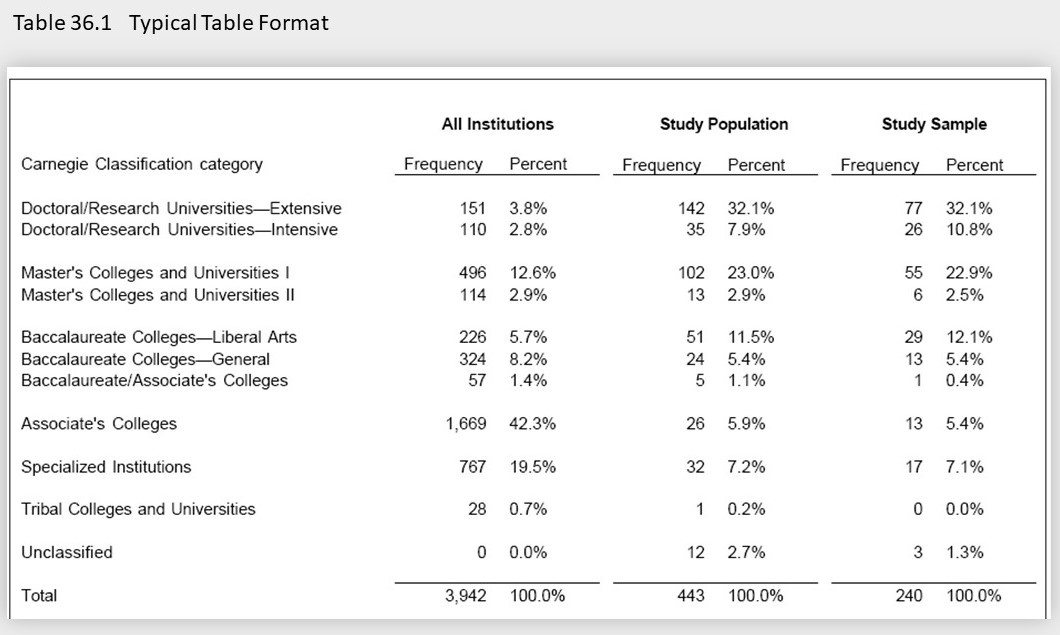
Tables are particularly good for showing exact figures and large amounts of information in rows and columns. Tables provide a large amount of data in a very compact but detailed manner and are helpful at attracting readers to specific data and at making comparisons between them. A few hints to create effective tables:
- The table should fit on a singular page. If the landscape page orientation is too small, then change the page layout to portrait.
- Label all parts of the table clearly and identify units in which figures are given.
- For long tables with many rows, shade alternative rows or increase the height of the cells.
- Use the acronym (n/a) or a row of dots/dashes to acknowledge missing data.
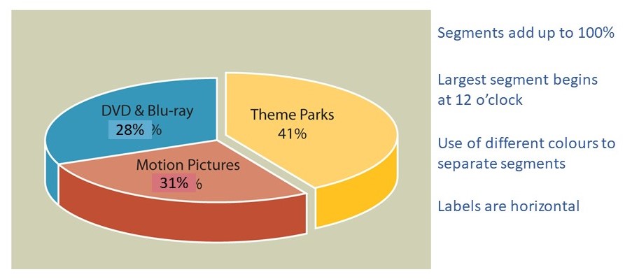
Pie Charts
A pie chart is a circular representation of a data set divided into sections that add up to 100 percent. Values of a pie chart start at 12 o’clock with the largest percentage appearing first and gradually smaller percentages included as you work your way around the clock. Pie charts are best used when comparing parts of a whole. To create effective pie charts:
- Include the percentage or specific number for each segment.
- Use a maximum of 4 – 6 segments in a pie chart. If there are several very small segments, group them into one segment labelled “other”.
- Separate segments using distinct and complementary colours.
- Ensure labels are horizontal
Bar Charts
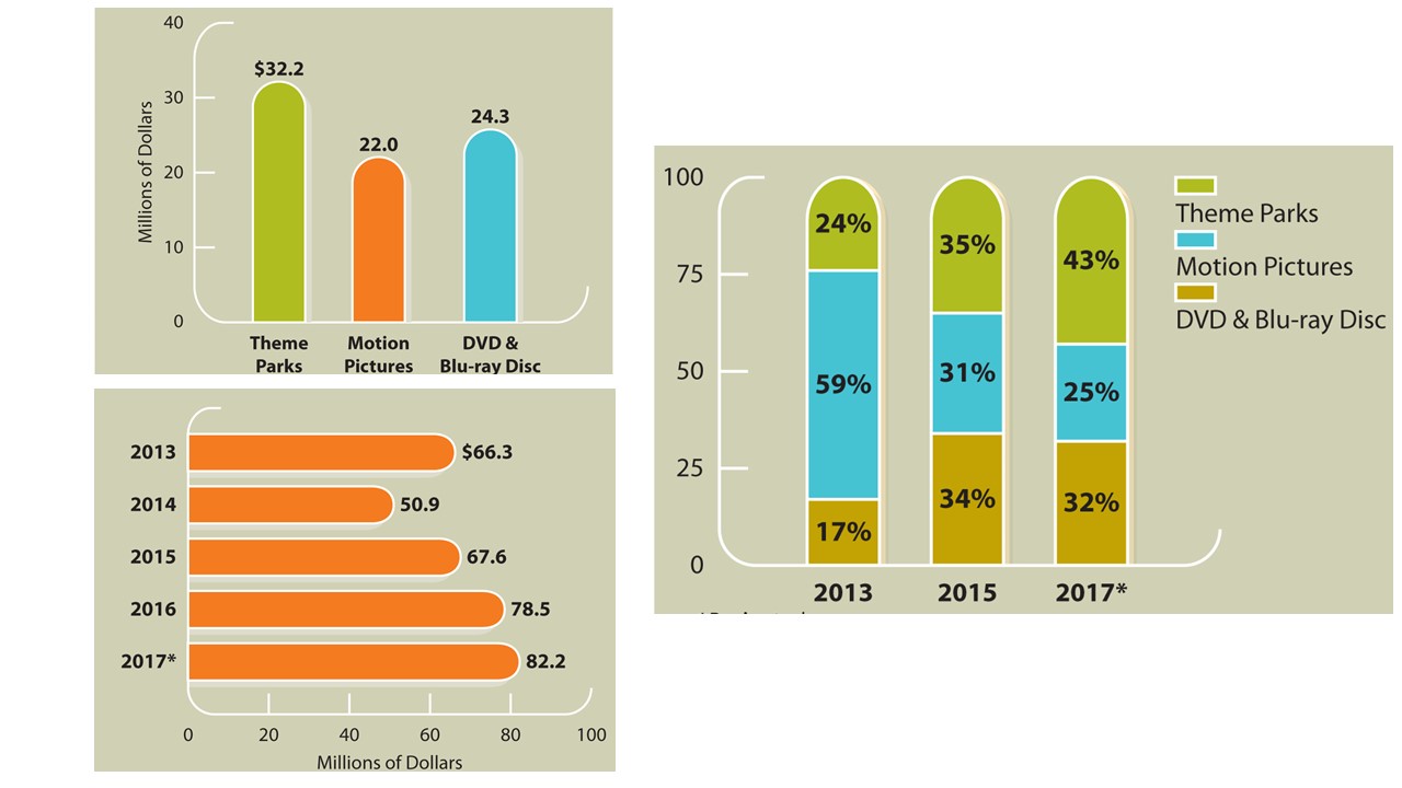
A bar chart should be used to show comparisons between items, comparisons over time, and the relationship between items. A bar chart displays information in columns (called bars) in a horizontal or vertical manner. Bars should be displayed according to chronological or logical order and can be segmented, divided, or stacked. Data must be accurately plotted and each bar should be the same width. To correctly format your bar chart:
- Keep the width of each bar equal
- Start scale at zero
- Avoid adding too much information (labels, legends, etc.) to keep the image simple
- Organize bars close enough to each other to make comparisons easy and meaningful.

Line Charts
Line charts show how items are related. Line charts can show trends, fluctuations, or progressions over time. A simple line chart will only show one set of data, and multiple line charts show two or more sets of data. To create a line chart
- The time component is measured on the horizontal bar across the bottom of your chart. The vertical bar is used to measure the second value.
- Use different types of lines (solid, dotted, dashed, etc.) to distinguish each variable presented.
- Use accurate values for both horizontal and vertical values to prevent distorting the information
- If necessary, include a key to explain lines and values
Flowchart
A flow chart lays out a procedure, process, or sequence of movements using shapes joined by arrows to demonstrate how the procedure, process or sequence works. Each shape represents a stage in the process and the arrows indicate what comes next. Flowcharts help to make complex processes and procedures simple to understand. Flow charts typically use shapes in the following way:
- ovals to signal the beginning or end of a process or procedure,
- diamonds to represent a decision point, and
- rectangles to show major activities or steps in the process or procedure.
Pictures
Pictures and illustrations show what something looks like. Pictures add authenticity and provide a visual record and are often used when the reader needs to know details that cannot be provided in any other manner. For example, if a reader needs to know what an item of clothing on a website looks like or what the new head office for the company looks like, a picture is best at communicating this information. In the digital world, using high resolution images and animating images adds another layer of reader engagement to a document.
Infographics and Data Visualization
Infographics create images out of data in a quick, clear, and engaging way. An infographic tells a story using a combination of graphic illustrations. Any sort of data can be displayed using an infographic, but it is most effectively used to display complex data with many components as a way to simplify that information and make it understandable to a wide audience. A typical infographic
- attracts a wide and diverse range of readers
- presents data accurately
- simplifies complex information
- transform pieces of data into a cohesive story
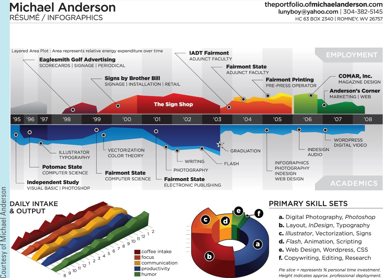
Table 36.2 Types of Graphic Illustrations and their Uses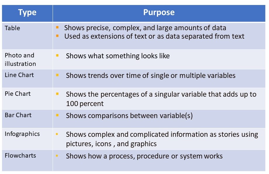
Knowledge Check
Formatting A Graphic Illustration
When you use an illustration in a report, there are several requirements to keep in mind.
Titles: All illustrations should have a title. Similar to a subject line for a memo or letter, the title of a graphic illustration communicates the main idea of the image and is composed of descriptive nouns and phrases, not full sentences. When creating your title, you may choose to create descriptive or talking titles. Include your title above the illustration.
Labels: All illustrations also must be labelled. Tables are labelled above the image, but all other illustrations are labelled below the image. Take a look at how the tables and other figures on this page are labelled. In addition, for bar and line charts, you must also label the x and y axis to ensure the reader knows what value is being measured on each axis.
Caption: A caption is a short descriptive passage that describes the image and its relevance. The caption should add important information for the reader and not simply repeat the title or state obvious information. The caption can also describe the data presented or include an interpretation of the data presented.
Legends: A legend are words written on or next to an image that explains information or symbols included as part of the image.

Other Formatting Requirements
In addition to the format requirements noted above, when integrating a graphic illustration into your work, consider the following:
- Introduce an illustration close to where the image appears.
- Help the reader understand the significance of the illustration by explaining what to look for or by summarizing the main point of the image. Avoid sentences that give no information other than directing the reader to the figure or table.
- Use a consistent size (not too large or small). Remember, the image must be readable.
- Do not distort the information by manipulating the scale or omitting information.
- Alternate graphics and text on the same page. Don’t put graphics on pages by themselves; ideally, no visual should take up more than one-third of any page in your report.
Documentation
Many graphic illustrations that you may use in your writing may come from a secondary source of information. Like all information that comes from secondary sources, the illustration must be cited. For a full overview of APA documentation requirements, please visit Unit 9 of this textbook. The following video will also be of assistance in understanding how to use APA 6th Edition to cite images in your documents.
The Infographic
An “Infographic” is a combination of the words “information” and “graphic.” In essence, an infographic is a form of visual communication meant to capture attention and enhance comprehension. The infographic is a specific type of visual communication that includes graphics showing data, copy, or both. The infographic uses these elements to communicate a story that attracts readers and promotes understanding.
Infographic Types and Styles
While there are many different presentations of infographics, there are three general categories that infographics can fall into: data visualization, information design, editorial infographics. Each serves a purpose and is an effective medium of communication when constructed correctly.
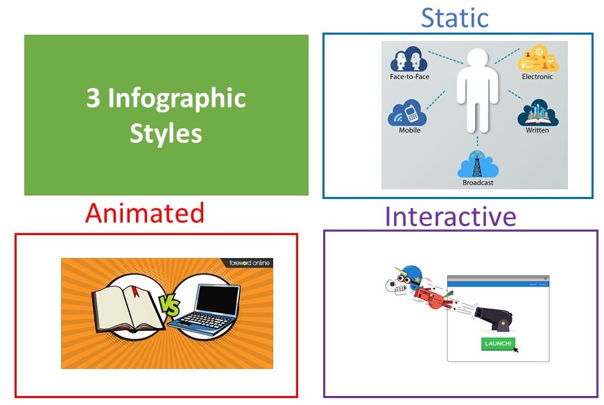
Infographics provide flexibility of design…you can do almost anything. However, infographics are often one of three styles.
Static Infographics: These are the most common type of infographics and are easiest to create. These types of infographics involve images, symbols, graphics, etc., but they do not move or provide interactivity.
Animated Infographics: As the name suggests, the animated infographic animates information, which means this type of infographic contains moving elements. Animated infographics are effective at attracting reader attention and at being included on social media, company websites, and in online tutorials. Learn more about animated infographics by visiting this page.
Interactive Infographics: The name of this infographic also foreshadows its distinguishing element: interactivity. Interactivity is best utilized for infographics that present large amounts or complex information. In order to present smaller and more understandable chunks of information, the reader is required to interact with the graphic as the story unfolds. Learn more about interactive infographics by visiting this page.
Knowledge Check
Creating an Infographic
In addition to the steps explained in the above video, when creating an infographic, keep in mind the principles of visual design discussed in Unit 14 of this textbook and these steps
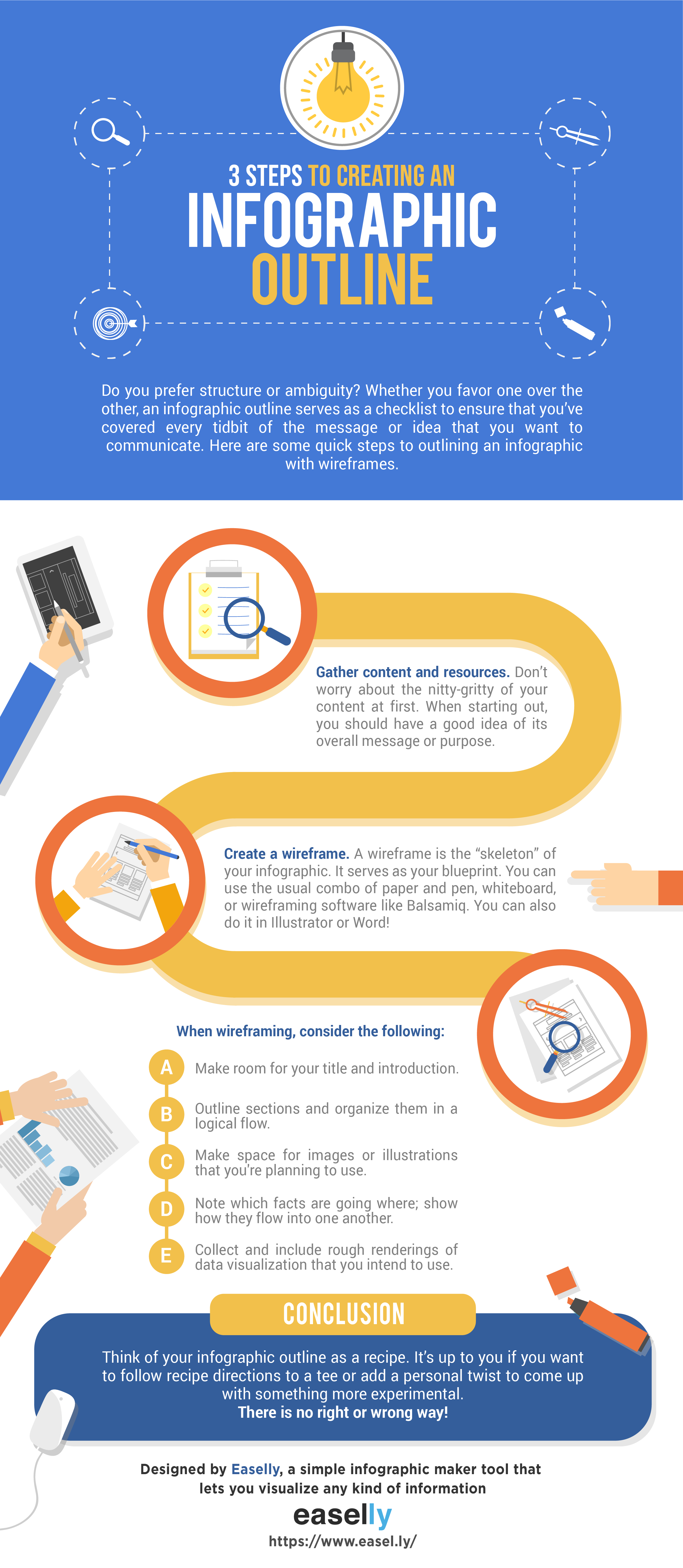
- begin with an outline (see these infographic template ideas to create an outline),
- emphasize the most important elements to create a focal point,
- select one or two easy-to-read fonts.
- use a complementary colour scheme,
- keep the message clear and concise,
- give visual priority over text,
- label the image,
- include a caption, and
- cite all images that you did not create or that do not have an open license.
Their function of all graphic illustrations is to save the reader time, enhance comprehension, and allow rapid comparison and interpretation of relationships or trends. Remember this as you prepare figures, tables, and infographics and present them accordingly.
Consult one of the following sites for additional information on graphic illustrations.
University of North Carolina a Chapel Hill
Key Takeaway

-
-
- Graphic illustrations help to simplify and clarify information
- Different types of graphics are best to communicate specific data
- Infographics combine images and graphics to illustrate data and information into a visual story
- Readers appreciate well-thought-out and designed graphics of all types.
-
References
365DataScience. (2018). Which is the best chart: Selecting among 14 types of charts Part I [Video file]. Retrieved from https://www.youtube.com/watch?v=C07k0euBpr8
Bovee, C., Thill, J., & Scribner, J. (2016). Business communication essentials (4th ed.). Toronto, ON: Pearson Canada Inc. Retrieved from http://www.pearsoncanada.ca/highered/product-showcase/new-solutions-for-core-foundations-from-pearson-canada/business-communication-essentials-fourth-canadian-edition-4e
CLIR.com. (n.d.). Part 2: Data tables and graphs. Reports. Retrieved from https://www.clir.org/pubs/reports/pub122/part2/.
Guffey, M., Loewry, D., & Griffin, E. (2019). Business communication: Process and product (6th ed.). Toronto, ON: Nelson Education. Retrieved from http://www.cengage.com/cgi-wadsworth/course_products_wp.pl?fid=M20b&product_isbn_issn=9780176531393&template=NELSON
Meyer, C. (2017). Communicating for results (4th ed.). Don Mills, ON: Oxford University Press. Retrieved from https://oup-arc.com/access/meyer-4e-student-resources#tag_case-studies
Octopus Digital. (2015). What is an infographic [Video file]. Retrieved from https://www.youtube.com/watch?v=xV4hnb2XKqc
PolyU ELC. (2017). How to reference an image from the Internet [Video file]. Retrieved from https://www.youtube.com/watch?v=epwdt2h1cDU&feature=emb_logo
Tomboc, K. (2018). Infographic design basics: 3 steps to outlining your infographic. easel.ly. Retrieved from https://www.easel.ly/blog/how-to-outline-an-infographic/
Visme. (2019). 14 infographic do’s and don’ts to design beautiful and effective infographics [Video file]. Retrieve from https://www.youtube.com/watch?v=uBBmbdPbfhw
Titles that objectively describe the facts presented.
Provide a subjective interpretation of information. Talking titles tell the reader what to think.
A visual representation on data that can also be used to compose traditional bar, pie, tables and line charts.
Instead of data or numbers, information design translates information normally found in processes, procedures or systems into a graphic. Thus, information from flowcharts, organizational charts, etc. can be used to create an information design.
Infographics that communicate issues about everyday life, for examples, clean energy infographics. These infographics highlight an important observation or phenomena about life.
