9.3 Designing Your Presentation
Suzan Last and Robin L. Potter
How you organize the contents of your presentation and how you design your slide deck will help to determine whether or not your message is conveyed in its most powerful form. This chapter will focus on speech structure and on slide design.
Speech Structure
You are by now familiar with the conventions of technical correspondence and report structure: introduction, background, details, conclusion. This structure forms the backbone for most messaging in technical fields. Many presentations are created using this simple structure as well, often melding the introduction and background together to save on time. The key message would constitute the high point of the presentation, followed by information that supports that point. This “triangle-shaped” structure is used commonly.
To determine how your presentation should be constructed, consider your purpose. In technology, the purpose often falls within the following, according to David McMurrey (1997-2017):
- Informative purpose: A presentation can be primarily informative. For example, as a member of a committee involved in a project to relocate the plant, your job might be to give a presentation on the condition of the building and grounds at one of the sites proposed for purchase. Or, you might be required to go before the city council and report on the success of the new city-sponsored recycling project.
- Instructional purpose: A presentation can be primarily instructional. Your task might be to train new employees to use certain equipment or to perform certain routine tasks.
- Persuasive purpose: A presentation can be primarily persuasive. You might want to convince members of local civic organizations to support a city-wide recycling program. You might appear before city council to persuade its members to reserve certain city-owned lands for park areas, softball and baseball parks, or community gardens.
When creating a presentation that has a persuasive message, you have structural options. You can organize your content using the traditional “triangle” method, or you can use the “what is, what can be” comparative method shared by Nancy Duarte in her presentation below The Secret Structure of Great Talks (2011). In this presentation, which offers a great example of effective persuasive presentation structure and design, Duarte reveals that speeches that have changed society make use of this “what is, what can be” structure, which compares what the current situation is to what the situation can be in its improved form after your great idea is implemented. Keep this structure in your toolbox for times when you want to persuade the reader to implement a new procedure, accept a proposed project, or sell a new product, for example.
Knowledge Check
A Brief Overview of PowerPoint
Even the most dynamic speakers often make use of visual aids to accompany their presentation and help illustrate their ideas. Having well-designed visuals as part of your presentation is one way for presenters to add interest and audience engagement to their talks. Despite much discussion on the pros and cons of this medium, PowerPoint is probably the most common software used to create presentations using visual aids. While many other presentation tools are worthy of your consideration, PowerPoint is a standard, versatile workplace tool, so it would be wise to gain proficiency with it. The key concept to remember is that your visual aids should supplement and illustrate what you want to say to your audience.
When designing a PowerPoint presentation, it is helpful to be familiar with the key terminology used to discuss the various elements.
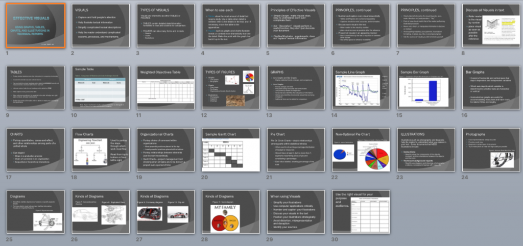
- Deck: The deck is the entire presentation (all the slides in the presentation; see Figure 9.2.1).
- Gloss: Gloss is what the speaker says about each slide. The speaker should not simply read what is on the slide. Slides should have minimal text in the form of keywords and short bullet points. It might include key quotations. The speaker should elaborate on what is written or shown on the slide.
- Slide: The slide is one “page” of the presentation (Figure 9.2.2 shows one slide from the deck above) with the various elements identified. Note the source entry for the image at the bottom of the slide. Even images must be cited!
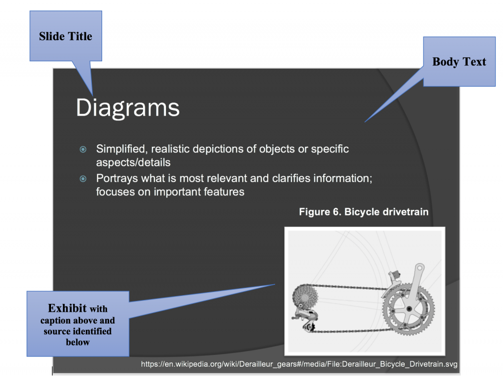
- Slide Titles: Usually at the top of the slide, the titles acts as “headings” indicating the topic to be discussed in each slide.
- Body Text: Body text is the written text on the slide, often in the form of bullet points or key terms. This text should be kept to a minimum (keywords/phrases; quotations you want to read out loud). Don’t write your “script” in the slide’s body text.
- Exhibits: Exhibits are illustrative graphics on the slides that are glossed in the presentation. You should discuss graphics and explain what is important about them.
- Decorative visuals: Decorative visuals are slide motifs, themes, and other non-essential images that add visual appeal to the slides, but do not illustrate substantive ideas.
- Sources: Citation notes indicating the sources for images.
- Notes: The section underneath the slide where you can write notes you want to cover in your gloss. The audience will not see the “notes” portion.
You may want to view sample presentations: Click on the presentations listed below or take a look at the PowerPoint decks that accompany this textbook to see detailed examples of effective presentation decks.
Knowledge Check
Designing Slides for Technical Information
You will probably be most familiar with the slide design illustrated above, with each slide containing a title and content consisting of bullet points. You will see this design in most of your professors’ lectures. Though it is the most commonly used slide design, it has also been criticized as being too rigid and resulting in poor long-term information retention. When this traditional slide design was compared to the assertion-evidence slide design discussed below, researchers discovered that using assertion-evidence slide structure resulted in deeper learning and understanding (Garner, et al. 2011).
Assertion-evidence slide structure, pioneered by Michael Alley at Penn State University, consists of a statement, or assertion, usually placed where the slide title would normally be placed. Among other types of content, the body of the slide would then include (excerpted from McMurrey, 1997-2017):
- Drawing or diagram of key objects: If you describe or refer to any objects during your presentation, show visuals of them so that you can point to different components or features.
- Tables, charts, graphs: If you discuss statistical data, present them in some form or table, chart, or graph. Many members of your audience may be less comfortable “hearing” such data as opposed to seeing them.
- Other research data or information: Usually presented in text or charts.
Below is a video by Robert Yale (2013) that reviews conventional PowerPoint disadvantages, studies in information retention, and the assertion-evidence structure. If you want to learn how to create slides using this method and see examples, please view this video as it is a good primer.
Visual Rhetoric
PowerPoint is not the only visual medium you might use. Posters, infographics, and other kinds of displays can also work to effectively convey your message if they are well designed. Considering how to present ideas visually can be as important as determining what to say. Here are some resources to help you design visual information in a rhetorically effective way:
Visual Rhetoric page from the Online Writing Lab (OWL) at Purdue University
Rule of Thirds (Wikipedia)
Psychology of Font Choices (The Daily Egg)
Putting It All Together
As you deepen your knowledge of general slide deck design, check out these two texts, which are considered key primers on the topic of presentation design.
- Garr Reynolds, PresentationZen: Simple Ideas on Presentation Design and Delivery provides a clear, easy-to-read set of tips for cutting through the noise and blather of modern life and reaching an audience through simple, pared-down slides and story-telling: two techniques that can help you connect with and inspire your audience in an authentic, genuine way.
- Nancy Duarte, Slideology: The Art and Science of Creating Great Presentations looks to the role of presentation software in the visualization of ideas and information. Its goal is to turn you into a “visual thinker” so you can design presentation graphics that enable your audience to easily and effectively process data—an especially valuable skill for technical presenters who often have to convey complex data in meaningful ways to non-technical audiences. Review the video below for a video explanation of these principles.
(How to Create Better Visual Presentations, 2014)
Knowledge Check
____________________________________________________________________
Note: Some of the contents of this chapter have been adapted from David McMurrey (1997-2017), Online Technical Writing: Oral Presentations. https://mcmassociates.io/textbook/oral.html CC by Attribution 4.0
____________________________________________________________________
References
Ally, M. (n.d.). Rethinking presentations in science and engineering. Penn State University Park. https://www.assertion-evidence.com/templates.html
Duarte, N. (2008). Slide:ology: The art and science of creating great presentations. Duarte.com. https://www.duarte.com/books/slideology/
Duarte, N. (2011, November.) The secret structure of great talks. TEDxEast. https://www.ted.com/talks/nancy_duarte_the_secret_structure_of_great_talks?utm_campaign=tedspread&utm_medium=referral&utm_source=tedcomshare
Duarte, N. (2014) How to Create Better Presentations [Video]. Youtube. https://www.youtube.com/watch?v=so9EJoQJc-0&t=2s
Garner, J.K., Alley, M., Sawarynski, L.E., Wolfe, K.L., & Zappe, S.E. (2011). Assertion-evidence slides appear to lead to better comprehension and recall of more complex concepts. American Society of Engineers. PDF.
Garr, R. (2011). PresentationZen: Simple ideas on presentation design and delivery. Toronto: Pearson. http://ptgmedia.pearsoncmg.com/images/9780321811981/samplepages/0321811984.pdf
Hunt, Ted. (2013, July 5). A pro designer shares the psychology of font choices. [Infographic]. The Daily Egg.
Keithonearth, [Bicycle image embedded in slide]. https://en.wikipedia.org/wiki/Derailleur_gears#/media/File:Derailleur_Bicycle_Drivetrain.svg. CC BY-SA 3.0.
McMurrey, D. (1997-2017). Online technical writing: Oral presentations. https://mcmassociates.io/textbook/oral.html
Online Writing Lab (OWL). Visual rhetoric. University of Purdue. https://owl.purdue.edu/owl/general_writing/visual_rhetoric/visual_rhetoric/index.html
Wikipedia. (2021, February 9 edited). Rule of Thirds. https://en.wikipedia.org/wiki/Rule_of_thirds
Yale, R. (2013). The Assertion-evidence structure for PowerPoint slide design. YouTube. https://youtu.be/xNW84FUe0ZA
